
Hong Kong Tourism Board Launches ‘Only in Hong Kong’ Global Campaign Targeting Malaysian Travellers

TLDR
- Hong Kong Tourism Board launches ‘Only in Hong Kong’ global campaign in 22 source markets
- Campaign built on four defining qualities — Variety, Vibrancy, Contrast and World-class
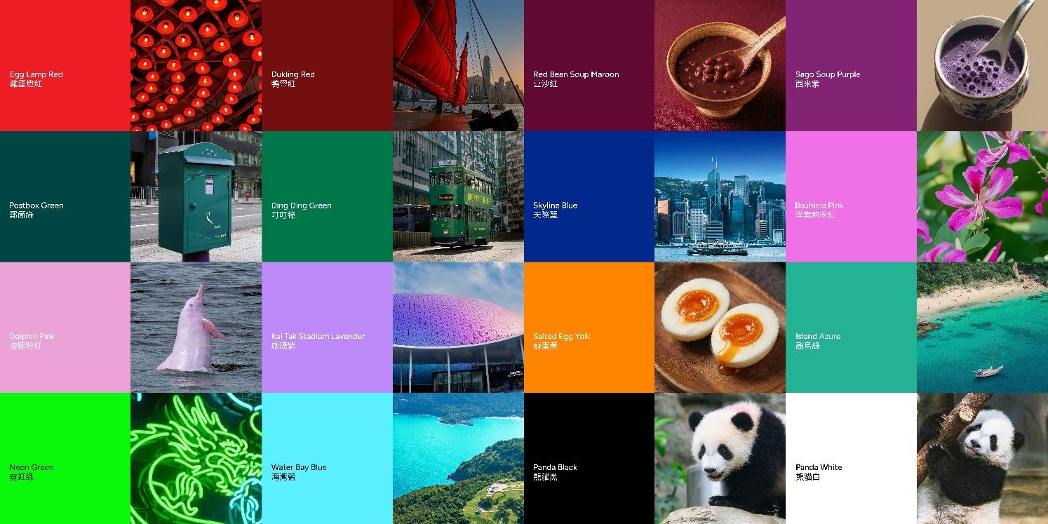
- Visual identity draws on a 16-colour palette inspired by Hong Kong’s street-level DNA
- Malaysia is a priority rollout market, with KOLs and overseas media invited to experience the city firsthand
- Tone is “curious, witty and playful,” leaning into East-meets-West storytelling
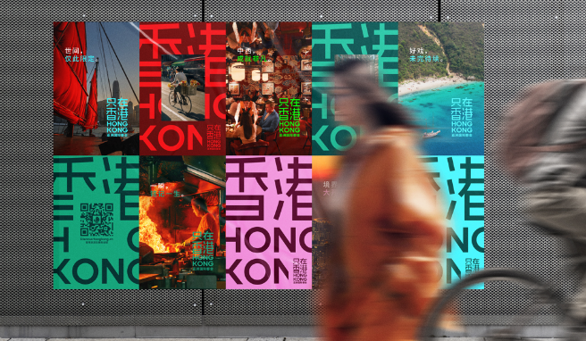
The Hong Kong Tourism Board has unveiled ‘Only in Hong Kong’ (只在香港), a new global campaign that reframes the city as a place to feel, not just to see. Launched across 22 source markets — including Malaysia, one of Hong Kong’s most important regional feeder markets — the campaign targets the gap between polished promotional imagery and the lived-in texture that defines a real visit.

A City Made To See. A City Made To Feel.
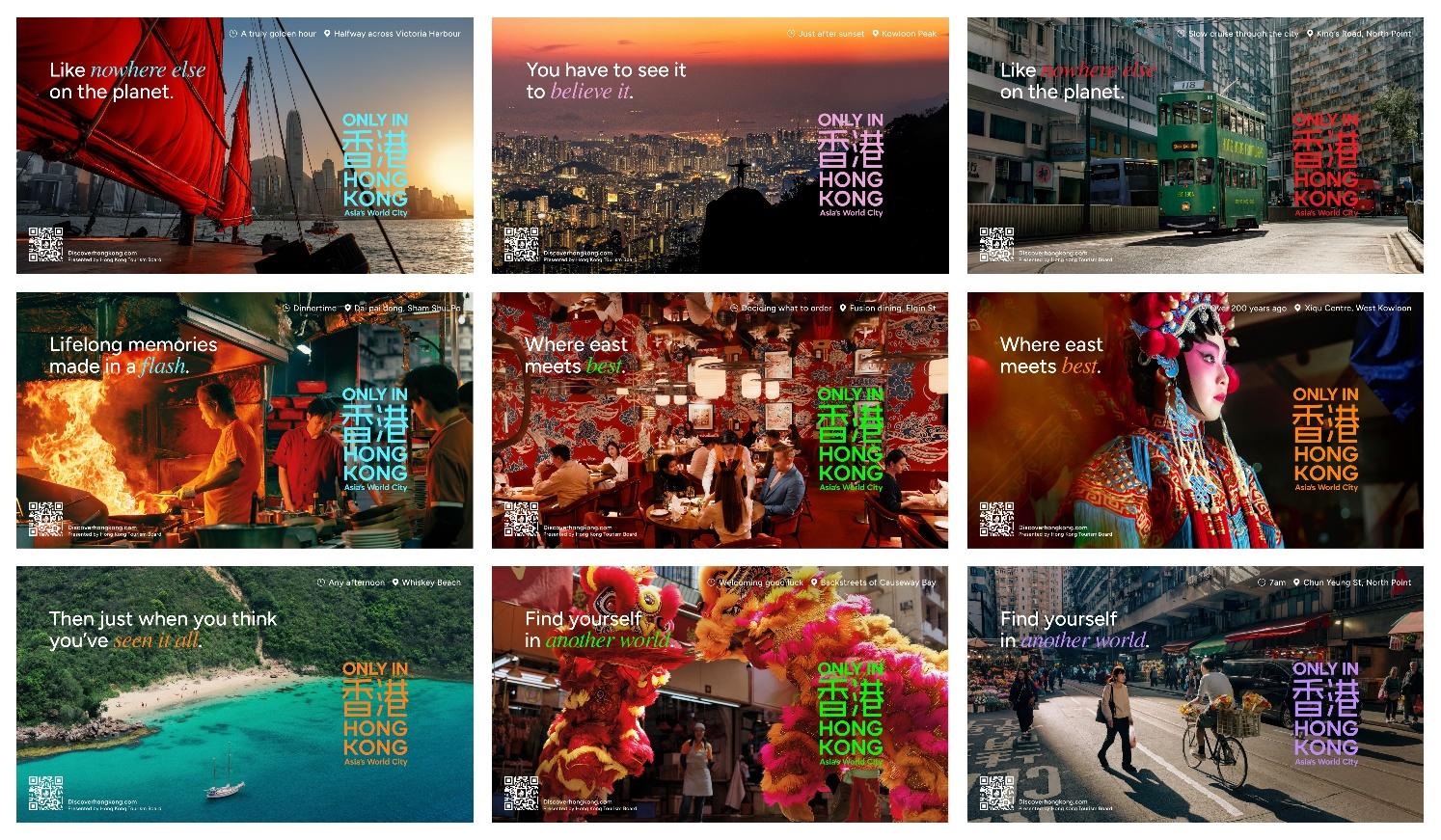
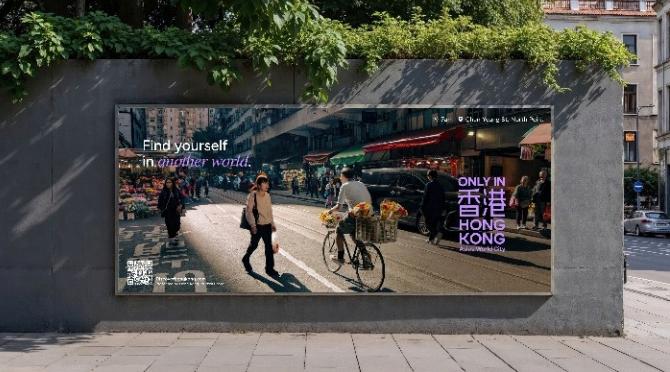
The campaign opens with a simple premise: a city is more than a list of attractions. From bustling high-street energy to secluded natural escapes, from Star Ferry rides and skyline hikes to the Kai Tak Stadium and the local neighbourhoods where mahjong tiles still clatter into the small hours, the campaign invites visitors to lean in. Hidden beaches and world-class hotels and bars round out a deliberately multi-dimensional picture of Hong Kong.
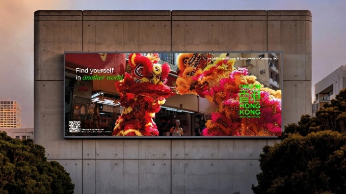
Rather than relying on glossy hero shots, the campaign draws from real street scenes — the textures, colours and authentic moments that differentiate the city from any other Asian metropolis. The result is a creative platform that feels less like tourism advertising and more like an invitation to participate.
Built Around Four Defining Qualities And 16 Colours
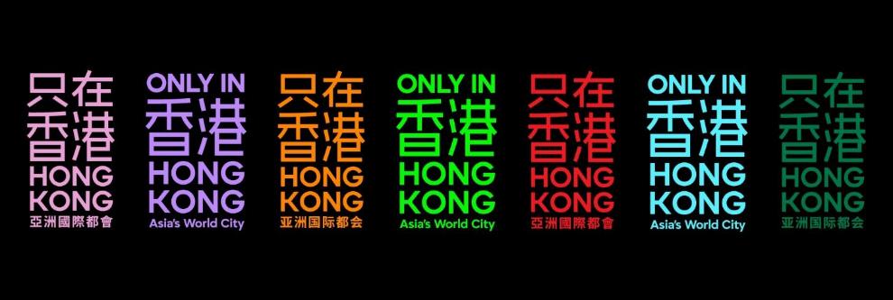
‘Only in Hong Kong’ is anchored in four qualities that the tourism board identifies as Hong Kong’s DNA — Variety, Vibrancy, Contrast and World-class. Each is brought to life through a distinctive visual system of 16 bold colours, drawn from iconic local references: Dukling Red for the timeless junk boats, Red Bean Soup Maroon for the joyous finish to every meal, Egg Lamp Red for market freshness, Sago Soup Purple for late-night desserts, Bauhinia Pink for the floral framing of the urban skyline.
Other palette entries include Kai Tak Stadium Lavender, Postbox Green, Ding Ding Green for the city’s 120-year-old tram heritage, Island Azure for the 1,180km of coastline, Dolphin Pink for the resident pink dolphins, Salted Egg Yolk for the signature cuisine, Neon Green for the city’s 24-hour pulse, Skyline Blue for the harbour horizon, Water Bay Blue for the lapping shores, and Panda Black and Panda White for the beloved panda twins. It is the most distinctive tourism visual identity Hong Kong has ever shipped.
A Wordmark, A Tone, And An Industry Coalition
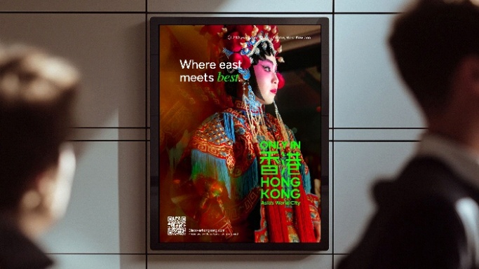
The campaign wordmark fuses the electric glow of Hong Kong’s neon street signs with the timeless imprint of a traditional Chinese signature seal — a deliberate marriage of heritage and energy. “Asia’s World City” sits at the base, anchoring the identity in Hong Kong’s positioning as a premier global destination where East meets West.
The tone of voice is “curious, witty and playful,” embracing Hong Kong’s unique personality and sense of drama. Headlines like “Here, every day is an event” and “It’s where East meets best” lean into the city’s theatrical streak, reframing everyday encounters as occasions. HKTB is also rallying the broader tourism industry — travel, hospitality, dining, retail, events and aviation — to use the campaign as a shared platform for telling Hong Kong’s story.
Global Rollout And The Malaysia Angle
The campaign has rolled out in phases, starting with high-impact digital and social media platforms, followed by global and regional TV placements, localised media channels and out-of-home across the 22 source markets. HKTB will also invite international KOLs and overseas media — including Malaysian voices — to experience the city firsthand and amplify the campaign through authentic storytelling.
Our Take
The ‘Only in Hong Kong’ campaign is a smart tonal reset for a city that has spent the last decade trying to compete with Singapore, Tokyo and Bangkok on luxury credentials alone. By leaning into Hong Kong’s idiosyncrasies — the ding ding trams, the pink dolphins, the mahjong tiles, the neon glow — the tourism board is acknowledging that the city’s competitive edge is not its hotels, it is its texture. That is the right call.
For Malaysian travellers specifically, the timing is excellent. Hong Kong has spent the last few years rebuilding its regional tourism pipeline, and a campaign that positions the city as a multi-day immersive experience — not a transit stop or a shopping run — opens up new itinerary possibilities. The Kai Tak Stadium angle is particularly relevant, with the venue now hosting major sporting events that pull Malaysian sports fans in their own right.
The 16-colour palette is also a masterstroke. It gives Malaysian content creators, KOLs and travel media an immediate visual shorthand to work with, which should accelerate organic amplification across Instagram, TikTok and YouTube. Expect Malaysian travel creators to lean heavily on the palette in the months ahead — it is the kind of distinctive identity that invites participation rather than just consumption.
The biggest test will be whether the campaign converts awareness into actual arrivals. Post-pandemic recovery across Asian tourism has been uneven, and Hong Kong has more ground to make up than most regional peers. If ‘Only in Hong Kong’ delivers the emotional pull the creative promises, the city has a real shot at reclaiming its position as Southeast Asia’s most distinctive urban destination.